Does dashboard design matter?
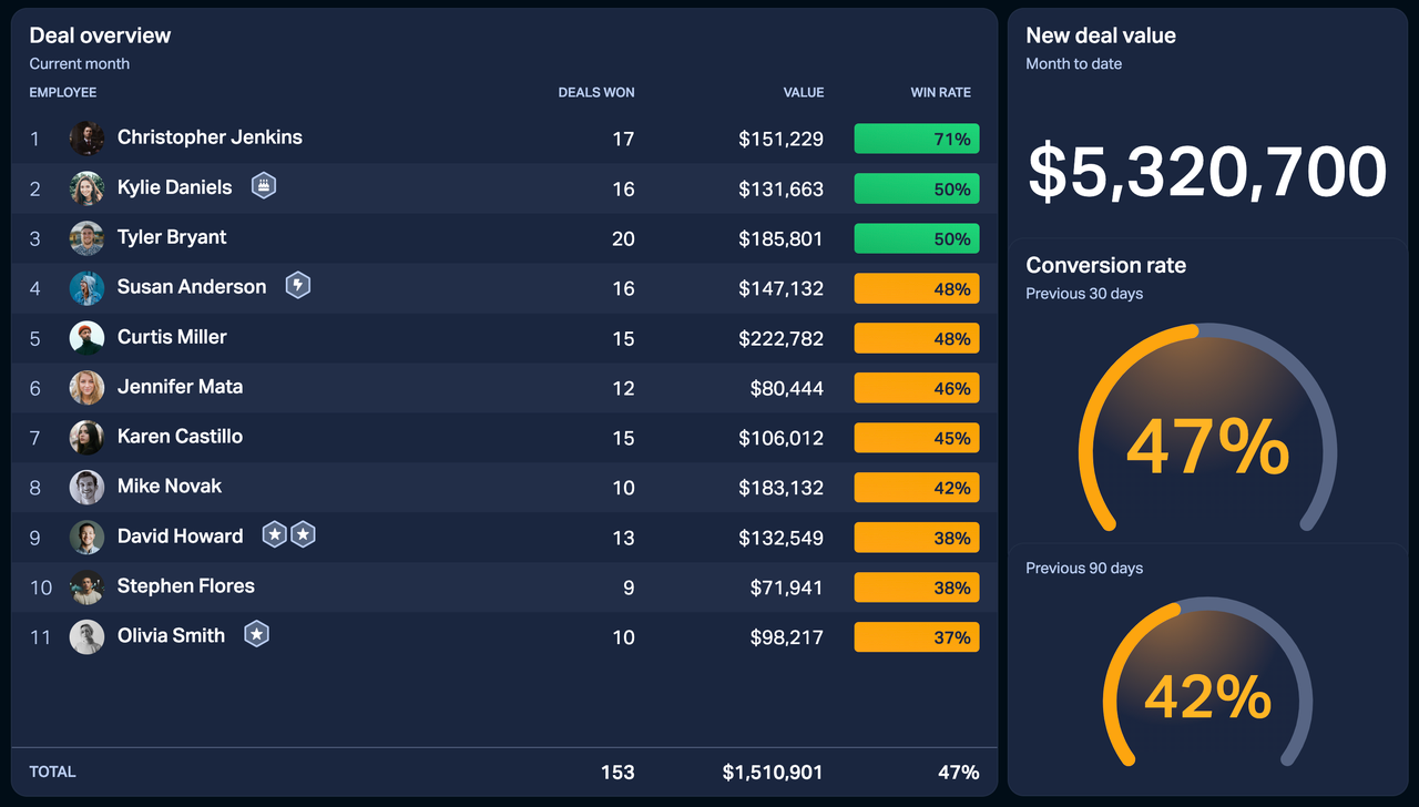
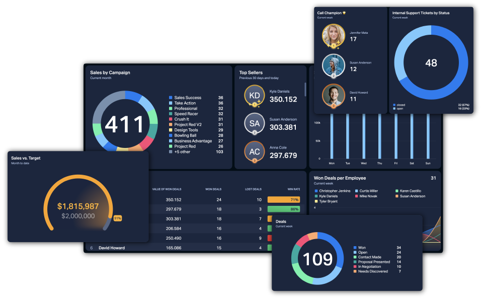
How well performance dashboards improve your business performance is directly related to their setup. Consider the examples here – which dashboard is less overwhelming?
We would argue that the dashboard on the left is more effective than the one on the right. All KPIs on the left dashboard are well organized and easy to understand at a glance. On the contrary, the dashboard on the right is overloaded with widgets and KPIs that show data but aren't useful.
As a business performance platform, our mission is not only to sell you the product but to teach you how to use it in the best possible way. We've gathered some tips for designing performance dashboards that actually work.
The 3 types of performance dashboards
The optimal dashboard design depends on who's going to look at it. Is it a call center agent, a manager, or the CEO? If you know your target audience, you will have a better understanding of what should go on a performance dashboard.
Performance dashboards can generally be divided into three levels – operational, analytical, and strategic dashboards.
Operational dashboards keep track of day-to-day activities by displaying smaller units that are closer to the raw data. It could be the number of calls, number of orders packed, number and value of sold items, and such.
Analytical dashboards visualize activities on a department level. They measure and identify trends so that businesses can make better future decisions and adjust their strategy.
Strategic dashboards display high-level metrics that reflect the overall business performance and focus on long-term business objectives.

1) Show 3–5 KPIs per person, but no more than 5
Dashboards need to be easy to understand, and everyone has to have a clear idea of what performance criteria they need to fulfill. Help your teams focus on the most important tasks by only visualizing the metrics that are critical to your business.

2) Different types of KPIs
Dashboard design strongly correlates to your performance improvements. It's not only about the number of widgets on your dashboard but also their quality. A well-designed performance dashboard should include the following KPIs:
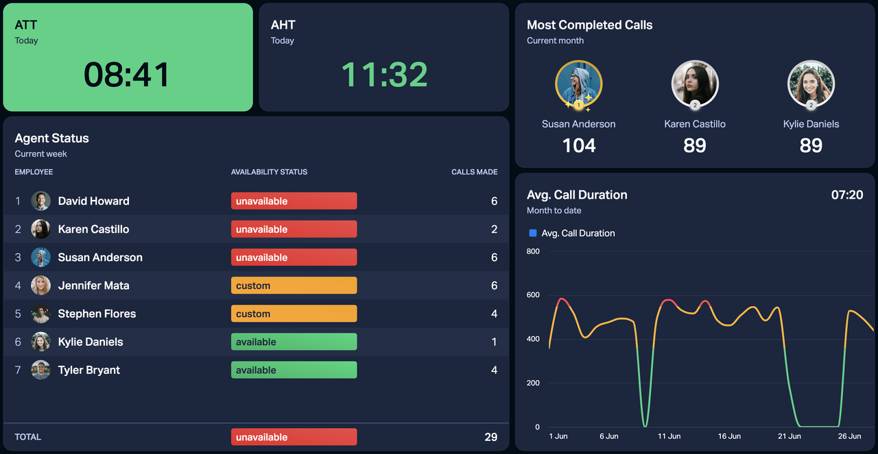
Activity KPI (such as number of calls, number of meetings)
Quality KPI (such as win rate, conversion rate, net promoter score)
Result KPI (such as deals won vs. target, meetings booked vs. target, number of won deals this month vs. last month)
Dashboards built with these KPIs allow you to identify the leading indicators (activity-based KPIs) as well as the lacking indicators (result KPIs). Bear in mind that everyone has an actual target that's defined based on your business ambition.
3) When in doubt, leave it out
Don't add KPIs to a dashboard that you wouldn't otherwise bring up for review during a team or one-on-one meeting. Avoid confusion, and focus only on the strategically significant performance indicators.
It's true our widgets look great, but if you have some extra space on the dashboard, give the existing widgets more air and make them bigger. You can always create more dashboards and add them all to the same slideshow.
4) Don't invent KPIs
Build your KPIs around your success criteria and only include KPIs that are critical to your business performance. Just because there's data doesn't mean you have to show everything. Consider if the KPI is valid – if nobody follows up on it, probably not.

5) Use dynamic targets
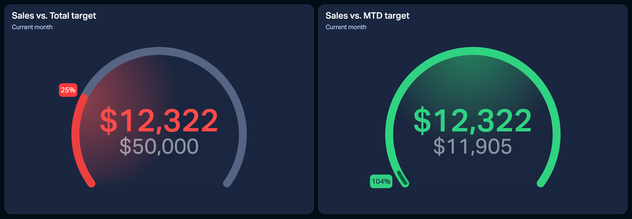
A dynamic target is a target that updates over time (daily, weekly) and that's based on a calculation – it can be data from a data source or an equation made with static numbers. An example could be a month-to-date target.
Imagine you want to reach $50k in sales this month. If you make 10k the first week, then some more next week, the actual value will still seem small compared to the target. The widget will be red for the most part of the month, which can demotivate your teams. What's more, the target is too big to conceivably estimate how much you have to make each day to stay on track.
With dynamic targets, you can divide the target value by the total number of days and multiply by the number of days so far. To do so, you should learn how to use the date function Days.
6) Include a forecast
If you are tracking data that spans more than a week, consider including a forecast. For example, display a sales forecast based on your team's hit rate – show how well the team will close the month based on everyone's current performance. That way, your team has time to react early to ensure they hit their targets by the end of the month.
7) One table widget is enough
Many of us like to overuse the table widget when designing performance dashboards. We'd recommend adding only one table widget per dashboard. The table widget is powerful, so make sure to give it enough space – it can take up half a dashboard or even the entire screen.
Keep in mind that you're not trying to replicate the data source on the dashboard. Instead, reflect on the critical indicators for your business and create a dashboard that is easy to understand.

8) The power of colors
Use colors and help everyone understand their progress with visual cues. Here's a basic example: Say you look at a dashboard across the office and can't really see the numbers. However, you see that a widget has just turned green – based on the color alone, you can tell that you've reached your target.
Choose your own conditions – be it numbers (value of won deals), text (call agent status "available"), or anything else. Plecto offers three colors – red, yellow, and green – that we call conditional colors. You can add conditional colors when you build a formula or, in some cases, directly on a dashboard widget.
