General widget settings in Reports
Create your Plecto reports using 8 different widgets designed specifically for our reports. Each widget is highly customizable to allow you to extract all the necessary information relevant to your organization and display your KPIs in a clear way.
Widgets use the same formulas and data as elsewhere in Plecto, which makes them easy to set up, and they will be automatically updated whenever your data changes.

Widget type
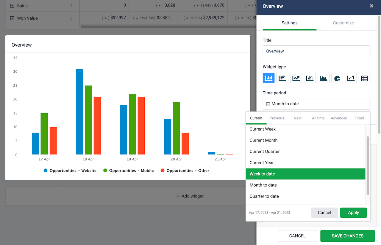
There are eight different widgets in reports. Plecto allows you to switch between and change the widget type even after you have added it to the report.
This allows you to adjust the visual representation of your KPIs without having to create new widgets and select all the settings again.

Time period
Choose to look at data from the current month, previous 3 years, all-time, between two custom dates, or other. You can select a different time period for each widget on the report.
The time period picker also displays a date preview so that you always get a clear overview of what time period is shown on the widget.
KPIs and Data
Add KPIs (formulas) to your widgets under the setting section called “KPIs.” Each widget allows you to add up to 20 KPIs.
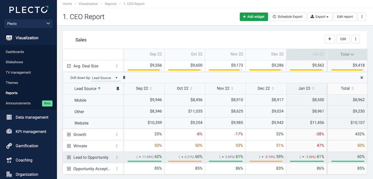
You can also choose to drill down your metrics by specific parameters, based on the fields available in your data source that the formulas are built on.
For example, if you display the number of all sales deals on a pie chart, you can drill the data down by status to see how many deals are lost or won.

Group by
All widgets support grouping data by time. Some widgets allow you to choose between grouping by Time or KPIs, namely, Column, Bar, Area, Pie, and Waterfall widgets.
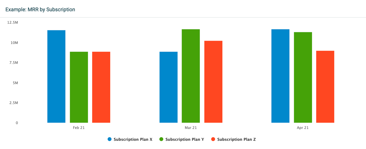
The difference is that grouping data by time will display all selected KPIs on a timely basis. For example, if you have selected a time period that displays data from the previous 3 months, the widget will show separate KPI columns for each month. This grouping option gives an overview of your KPIs over time.
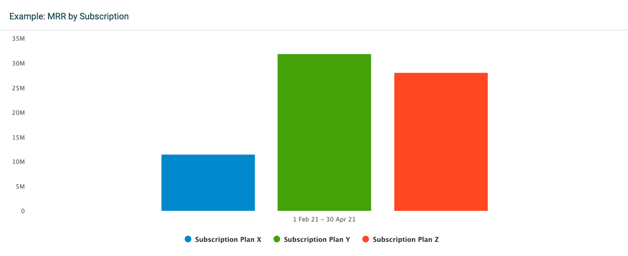
If you select to group data by KPIs, the widget will display only one column per KPI. The column will then show accumulated data for the selected time period, in this case for the previous 3 months.
Compare to
Compare your KPIs to other time periods or, in some cases, a target KPI. All widgets support comparing data to another time period.
Filter data by
These filtering options are common for all widgets:
If you want to see all data, select Filter data by > All.
If you want to see data from specific teams or employees, select either the Teams or Employees option and add the teams or employees from the list.

