Combo chart
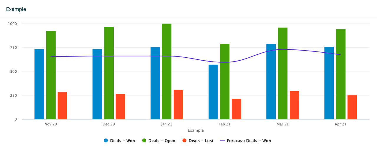
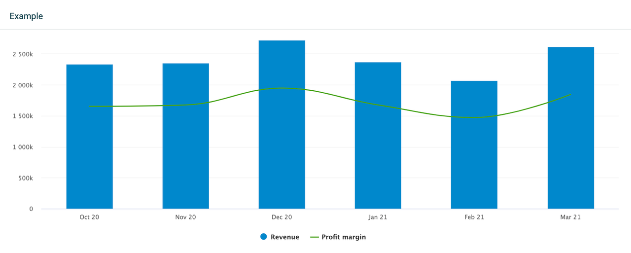
The combo chart is a combination of column and line charts. It allows you to display different types of data in one widget. The combo chart can be useful when you want to see, for example, the actual values of your data in comparison to a target value, revenue in comparison to the profit margin, or others.

Data and KPIs
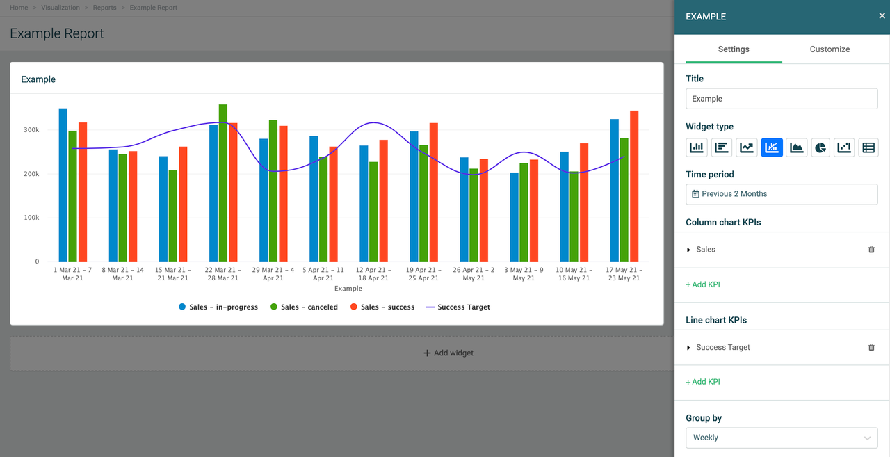
The combo chart settings have two defined KPI fields - one for the column chart and one for the line chart. Add your KPIs (formulas) under either field, depending on how you want your data to be displayed.
The combo chart can hold up to 20 KPIs on a single widget. Add an existing formula, edit it, or create a new formula right from the settings menu.
You can drill down your metrics by specific parameters, based on the fields available in your data source that the formulas are built on. For example, if you display the number of all sales deals, you can drill the data down by stage to see how many deals are open, lost, won, etc.

Group by Time
The combo chart allows you to group data by time. Grouping by time will display all selected KPIs on a timely basis, depending on the selected time period.
For example, if you look at data from the previous 2 months, the widget will allow you to select between a daily, weekly, or monthly grouping. If you look at data from the current year, the widget will allow you to group data monthly, quarterly, or annually.
Compare to another time period
You can compare your data to a different time period on a combo chart. The comparing options depend on the selected time period and the selected grouping (group by) method.
For example, if you set the time period to the current month and group by monthly data, you can then compare your data to the previous month or the same month last year.
Alternatively, if you set the time period to the current month and group by weekly data, you can compare the data to the previous week or the same week last month. This structure applies to all the available time period options.
Filter data by
These filtering options are common for all widgets:
If you want to see all data, select Filter data by > All.
If you want to see data from specific teams or employees, select either the Teams or Employees option and add the teams or employees from the list.
Customize your Combo chart
The combo chart offers plenty of customization options. When editing, go to the Customize section in the upper-right corner. From there you can adjust settings for the horizontal and vertical axes, legends, as well as individual settings for both the column and line charts.
